Brand basics
Warm, plain and easy to read.
EverWhen is used by people who want to stay in their own homes, and by the family who love them. It should feel like a kind neighbour rather than a hospital — so the colours stay warm, the type stays large, and one violet does all the pointing.

Colour
One violet, and warm neutrals around it.
Violet is the only strong colour in the interface, and it always means “this is the thing to press”. Everything else is warm stone, which is what keeps the app from feeling clinical.
#7C3AED is the action colour — buttons and the wordmark. #8B5CF6 is the accent, for icons and links.
Neutrals
Status colours
Five states, used the same way everywhere. Each one always carries an icon and a word as well as a colour, so it still reads for someone who is colour-blind or looking at a greyscale screenshot.
Typography
The phone's own typeface, set large.
The app deliberately ships no custom font. It uses whatever face the phone already uses — SF Pro on iPhone, Roboto on Android — because that is the face the operating system's large-text settings were built around. Our website uses Inter, which sits close to it.
Good morning, Evelyn
Your next check-in is at 11:30 AM.
SF Pro · Roboto — the system face
Good morning, Evelyn
Your next check-in is at 11:30 AM.
Inter
Nothing on the main screens goes below 15 pt, and every screen keeps working when someone turns their phone's text size all the way up.
Screenshots
The app, as it actually looks.
The daily check-in is the heart of it. One layout, three states — the words and the tint change, the buttons never move.
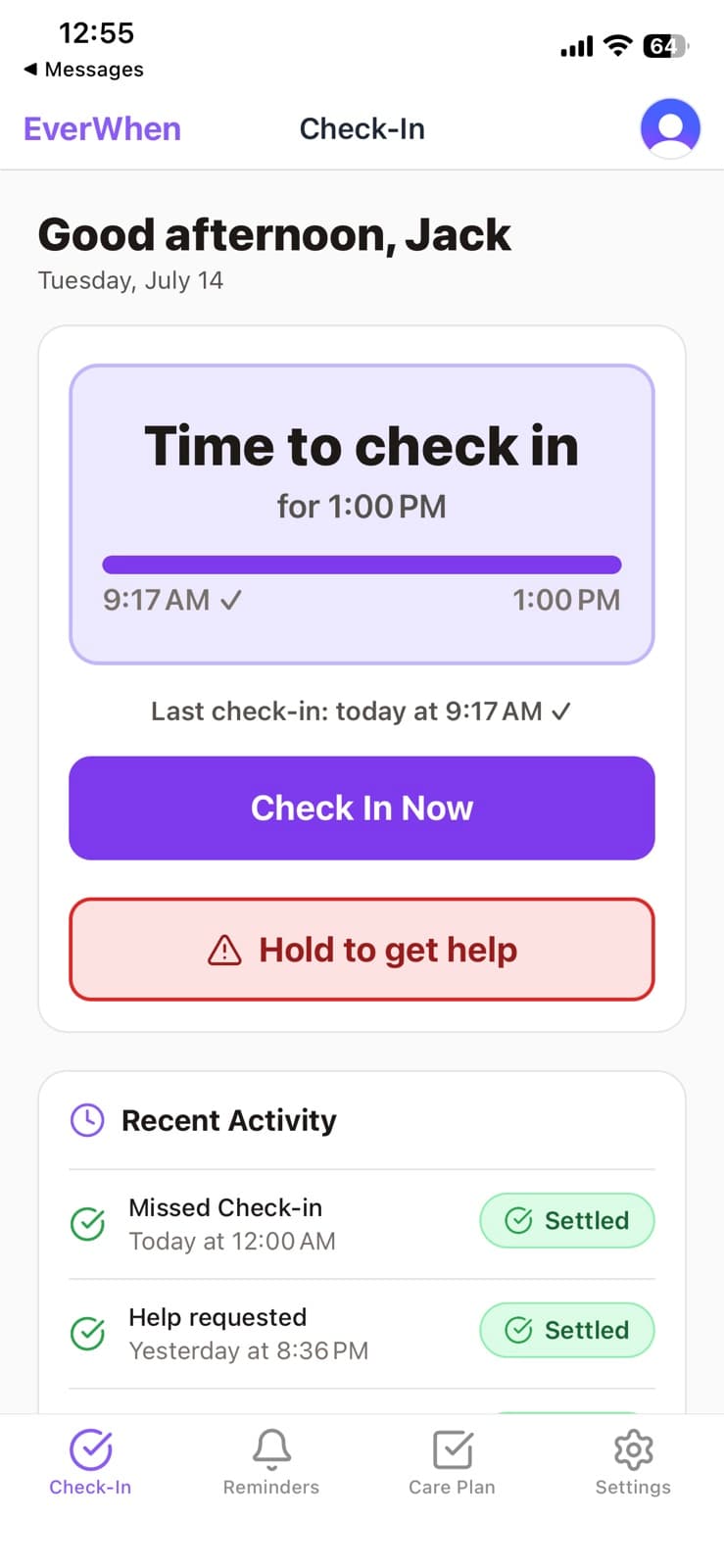
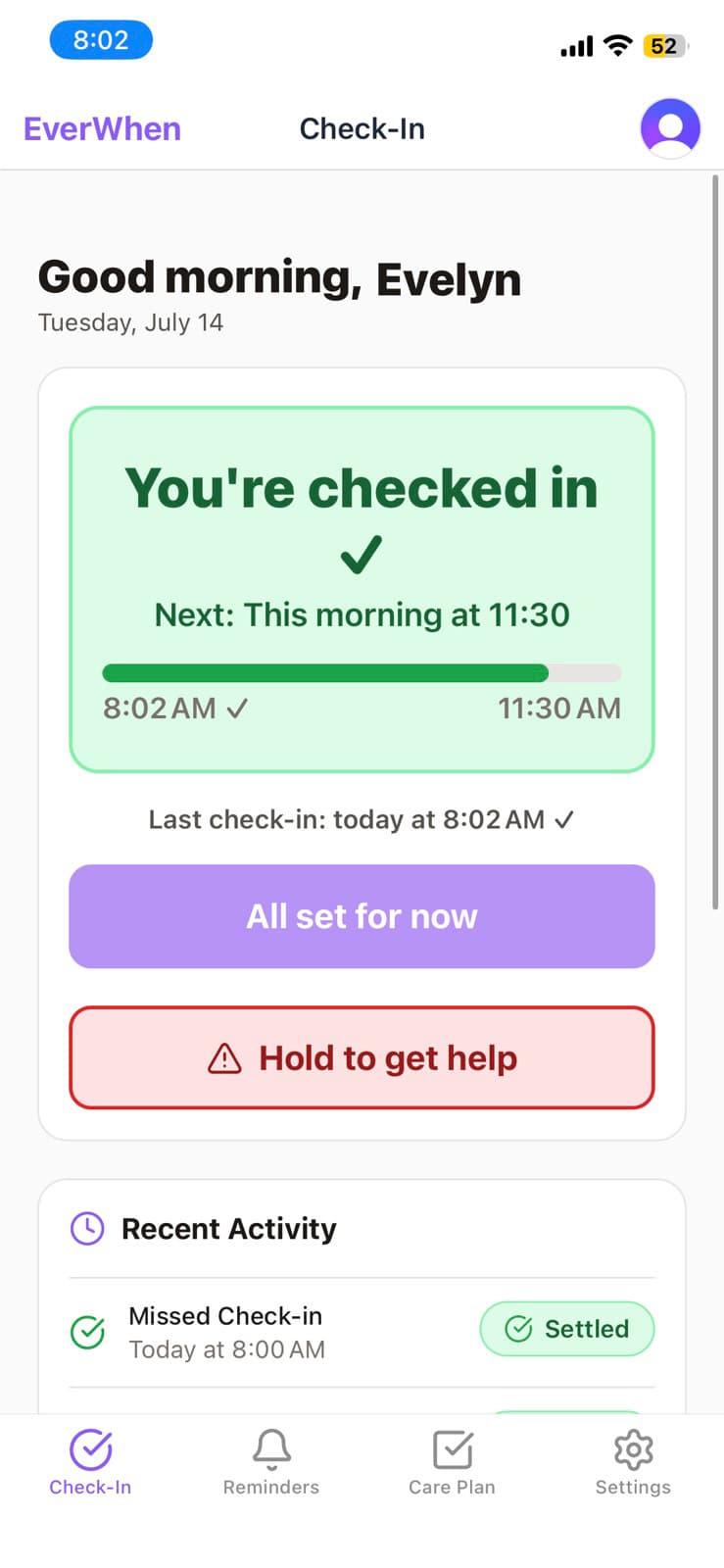
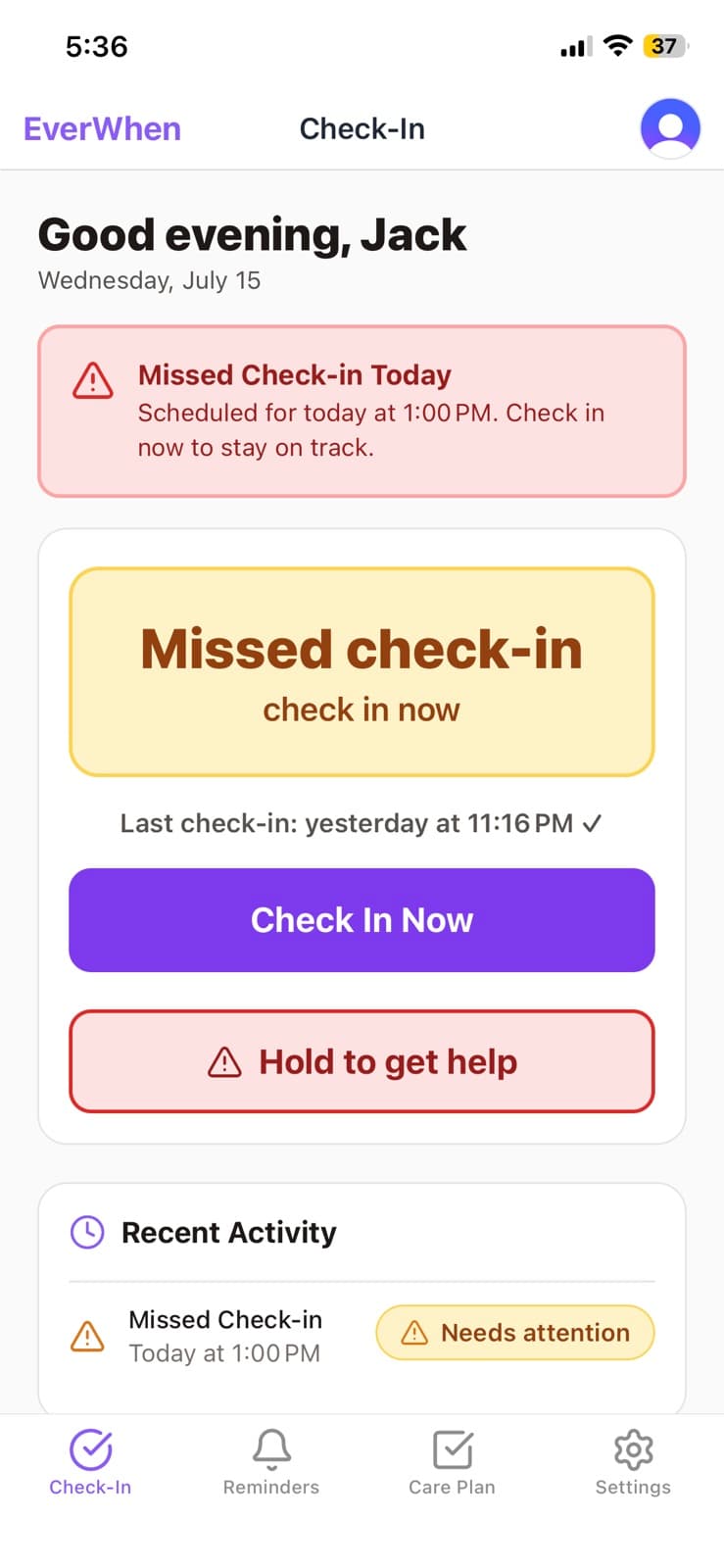
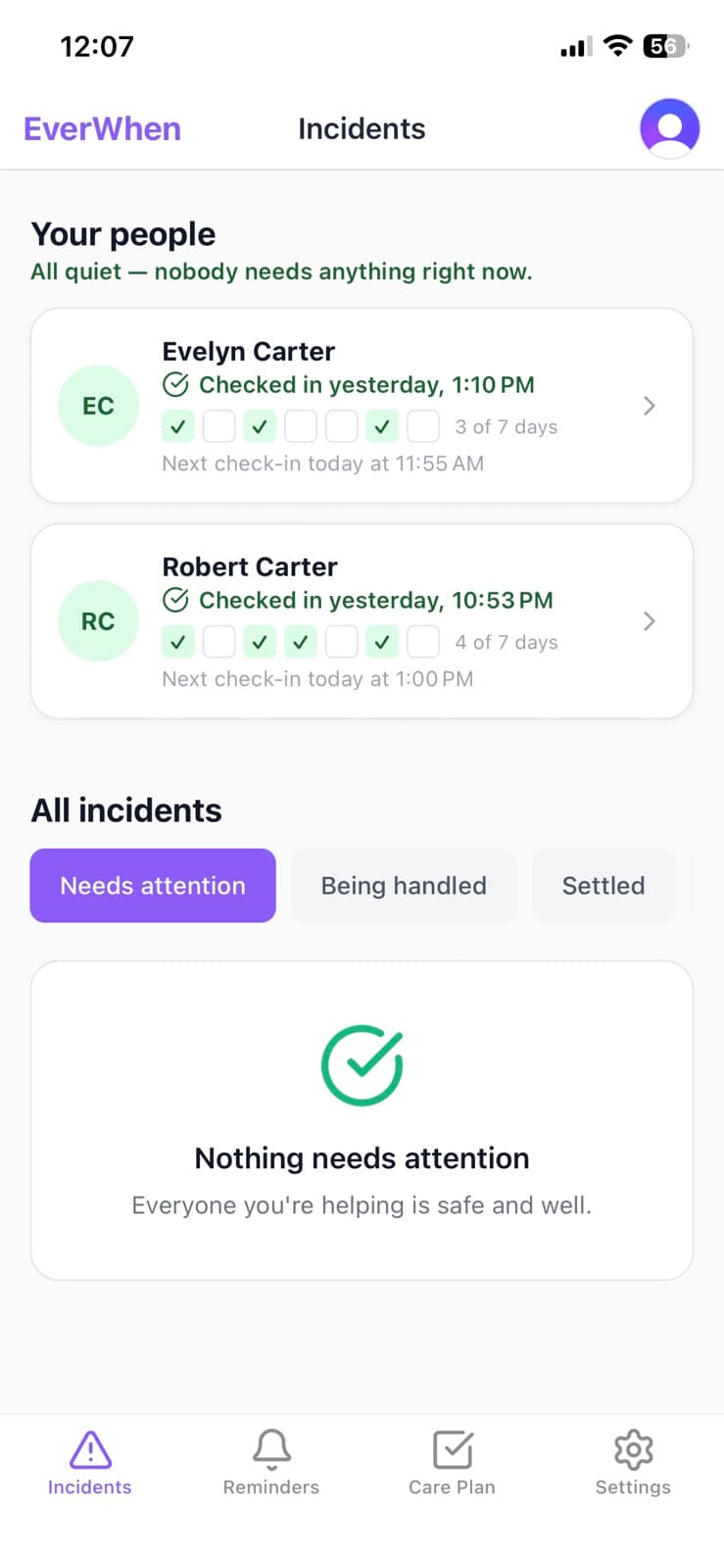
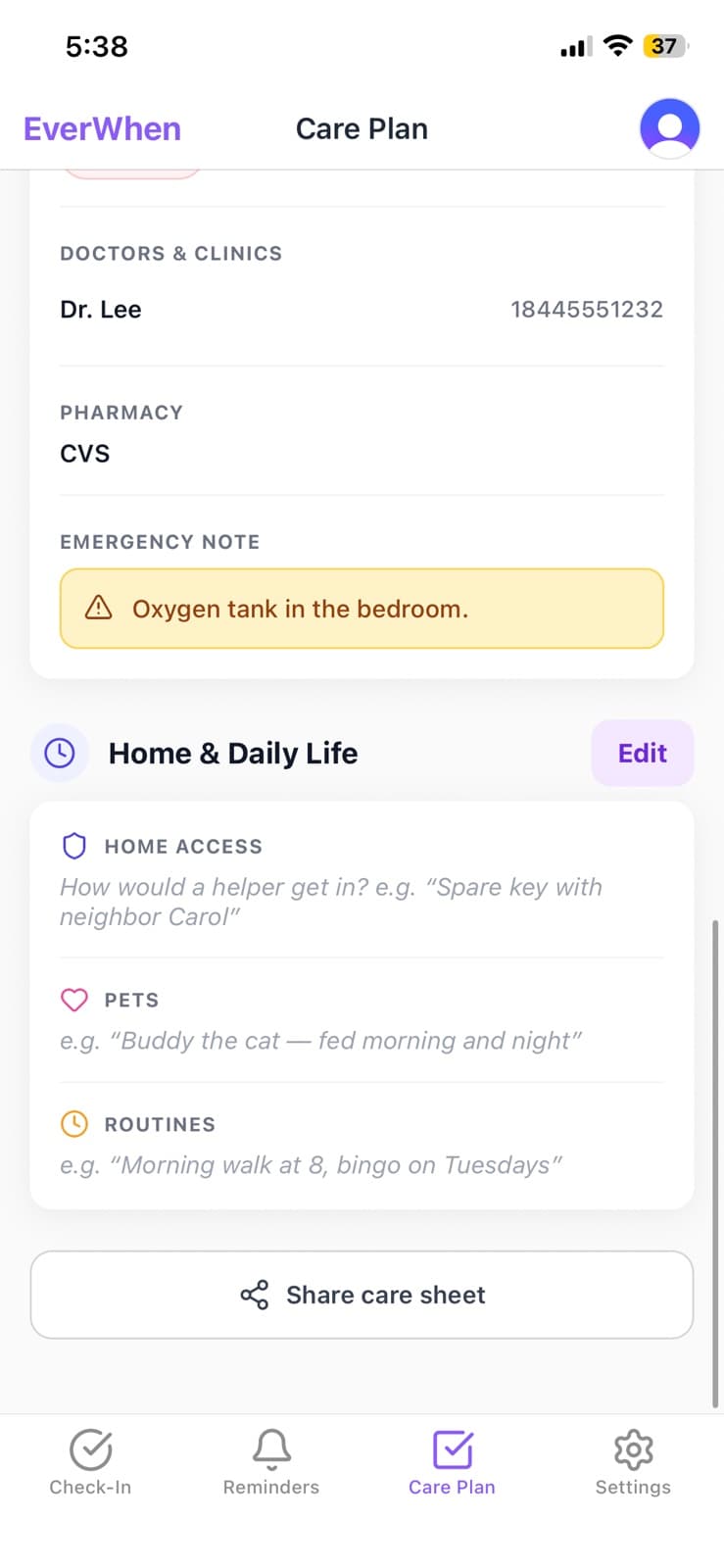
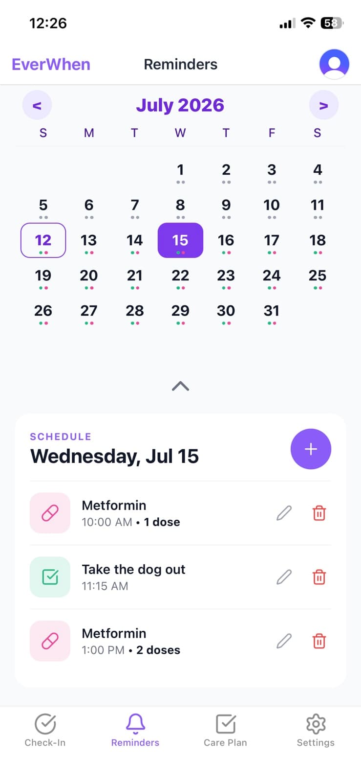
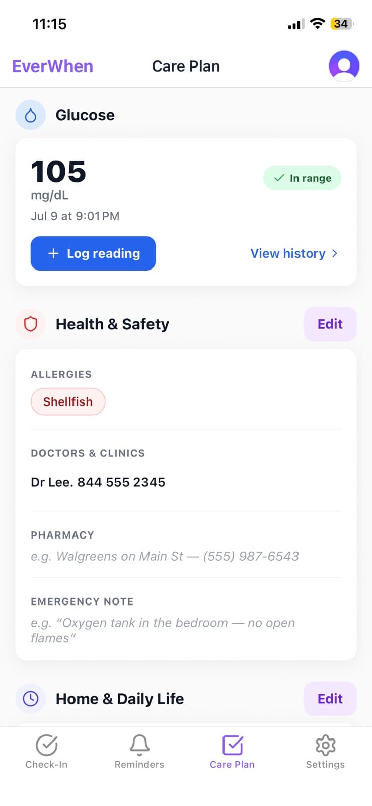
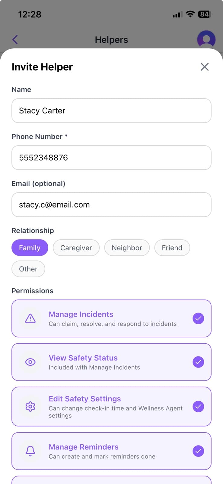
Screenshots are from the live app and may be used in coverage of EverWhen. Please don't crop out or recolour the status wording — it's there for accessibility.
Using the EverWhen name
- Always EverWhen — one word, capital E and capital W.
- Never Everwhen, Ever When, EVERWHEN or everwhen.
- Please don't redraw, stretch or recolour the app icon.
- EverWhen is not an emergency service — please don't describe it as one.
Press & partners
Need logo files, higher-resolution screenshots, or something not shown here? Get in touch and we'll send them over.
Contact us